
It's not bad, though I really liked the original old-school design of the early poster more better. If I hadn't already fallen for the early poster I'd probably like this one enough.
.


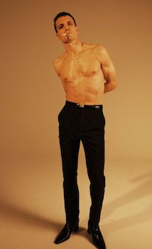
"I too quit smoking (2013) AND find this type of pictures cool. Also, PSA: if you're feeling like you want to start smoking again, just remind yourself "I do not want my body and house to stink like stale horseshit", then go drink one more glass of water to entertain your hands and lips. Congrats, btw."--- Anonymous congratulates us on another year of not smoking, which we celebrated with an enormous photo-dump of sexy smoking pictures as we're wont to do, annually. .


3 comments:
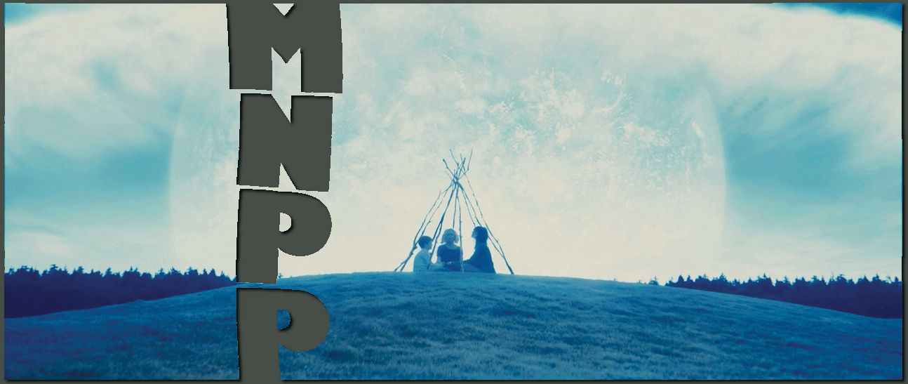
See, I like this one better because it's more clearly intended to be a poster for a horror movie, directed at a mainstream audience in the mood for a scary movie. The old one had that tinge of gee-whiz Americana "pull up to the drive-in with your best girl" nostalgia that can be unbelievably cloying in King and Darabont's work.
Sean, you just sounded SO MUCH like my boyfriend - he can barely make it through anything King's ever written, including "The Mist," due to the heavy-handed Americana "I love this rock ditty" BS.
Me, I just see it as an inherent part of King's work and, sure it's cornball as all get-out, but there's something relaxing about it to me. So the poster fit.
It looks like a weird combination of an assumption of War of the Worlds, Children of Men, and two of my favorite episodes of Hey! Arnold. Weird.
Post a Comment